
Green House
This eco-friendly eCommerce website is designed to promote sustainable products and create a positive environmental impact. The platform offers a wide range of eco-conscious products, including reusable goods, organic items, and energy-efficient products. The website's design and functionality are focused on providing a seamless shopping experience while raising awareness about sustainability.
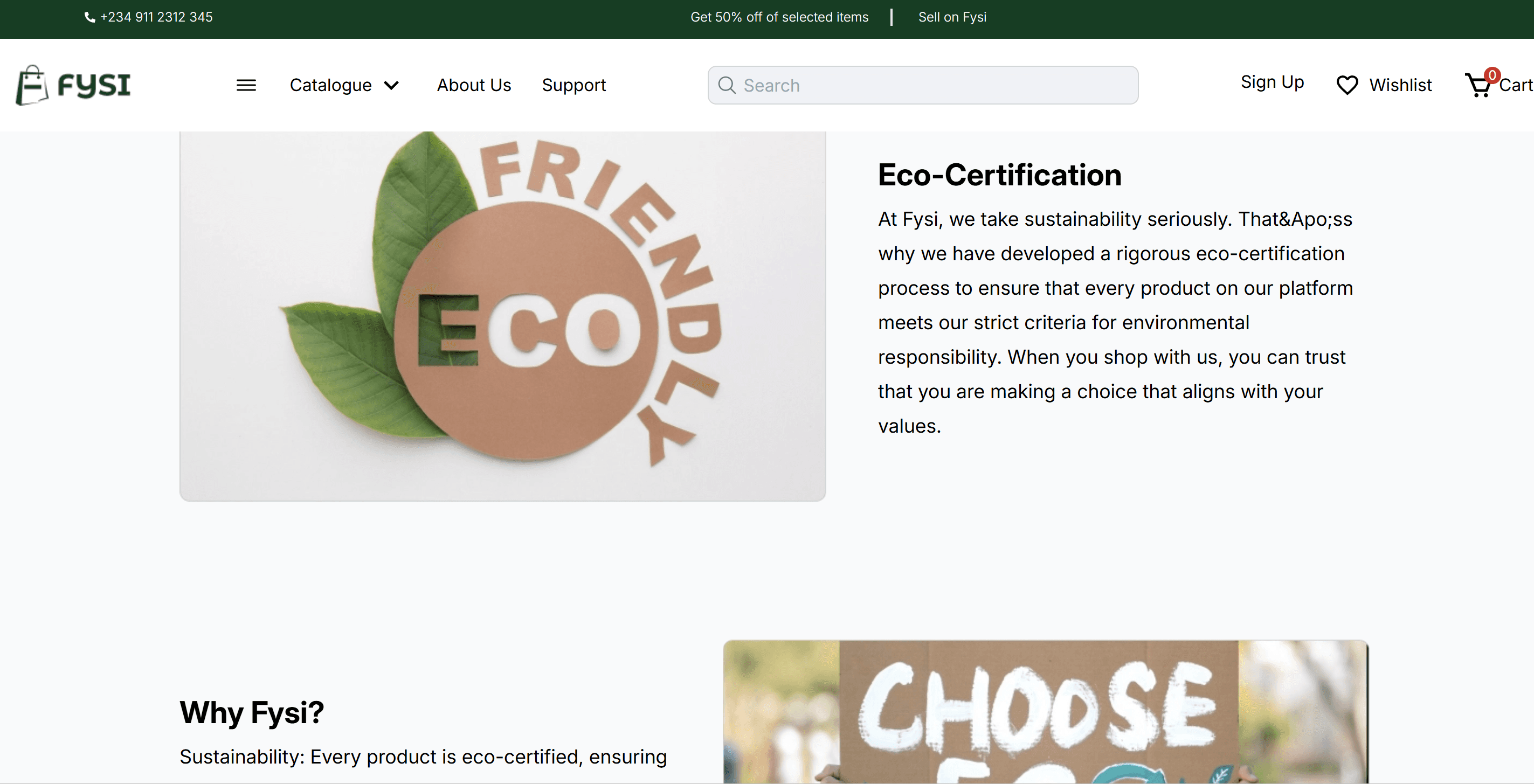
Project Purpose and Goal
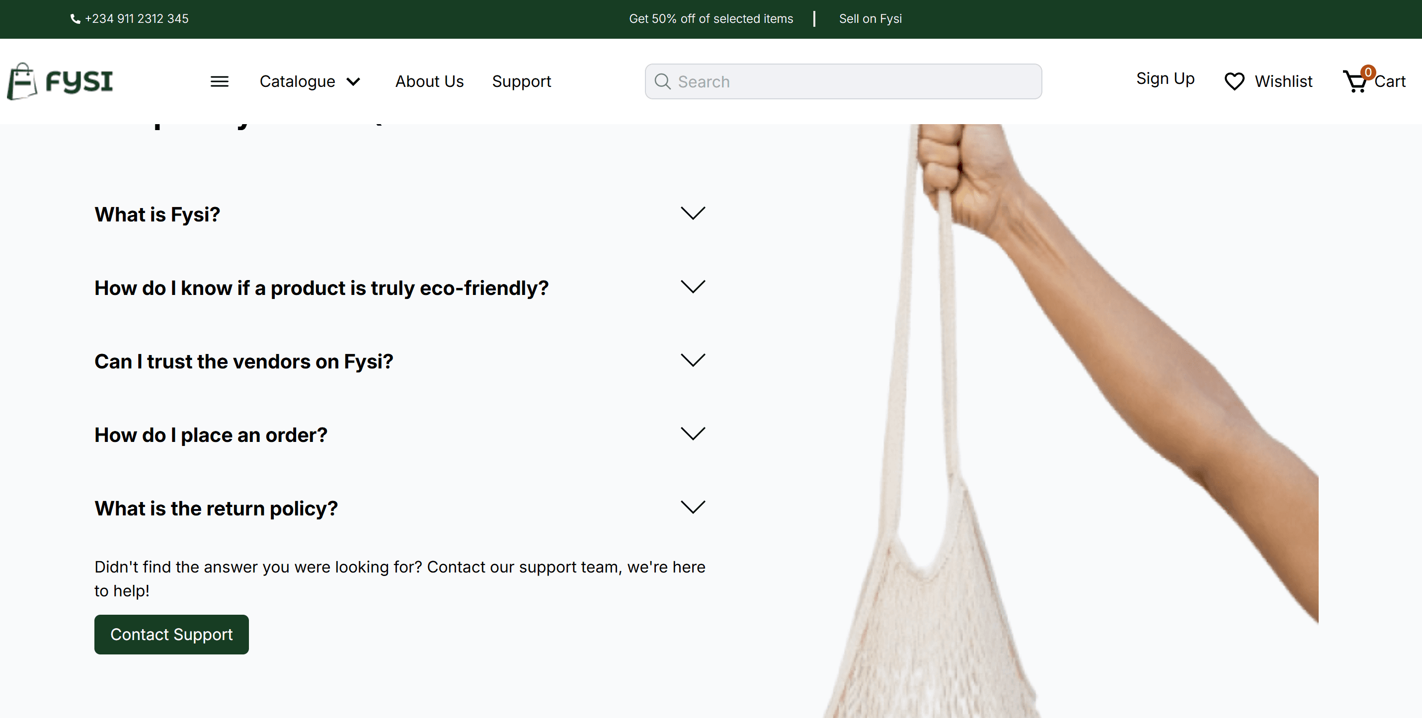
I worked on building key pages for the site, including the FAQ, Support, and About pages. These pages were designed to provide essential information to users, ensuring they could easily find answers to common questions, get assistance, and learn about the brand’s mission and values.
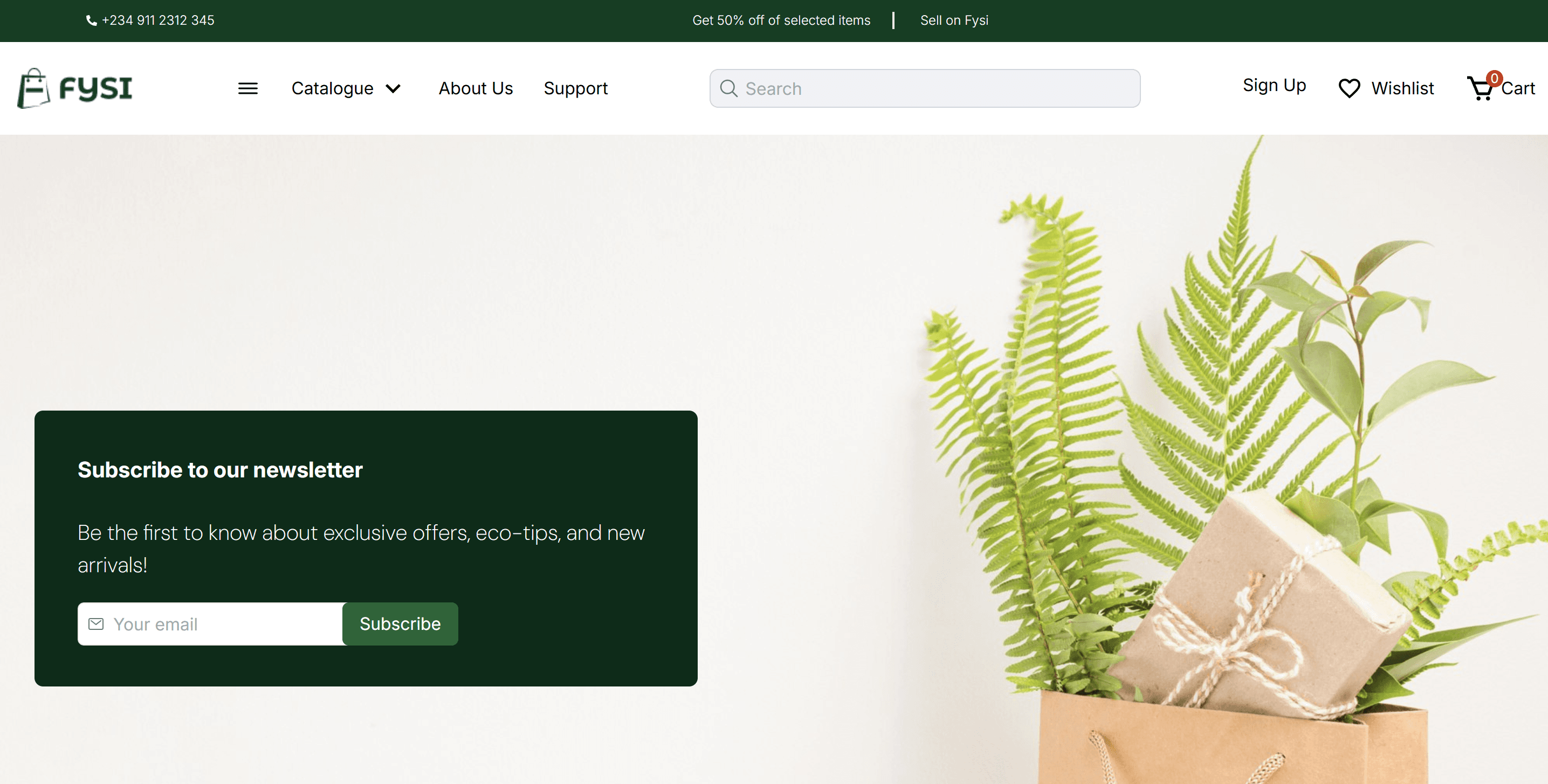
In the second phase,During this phase, I focused on creating clean, user-friendly layouts for each page. The design emphasized simplicity and accessibility, making it easy for users to navigate and understand the eco-friendly products and the brand’s commitment to sustainability.
After development, I helped test the pages for responsiveness and functionality across different devices. Once everything was working smoothly, the pages were deployed, contributing to the overall launch of the site.
Web stack and Explanation
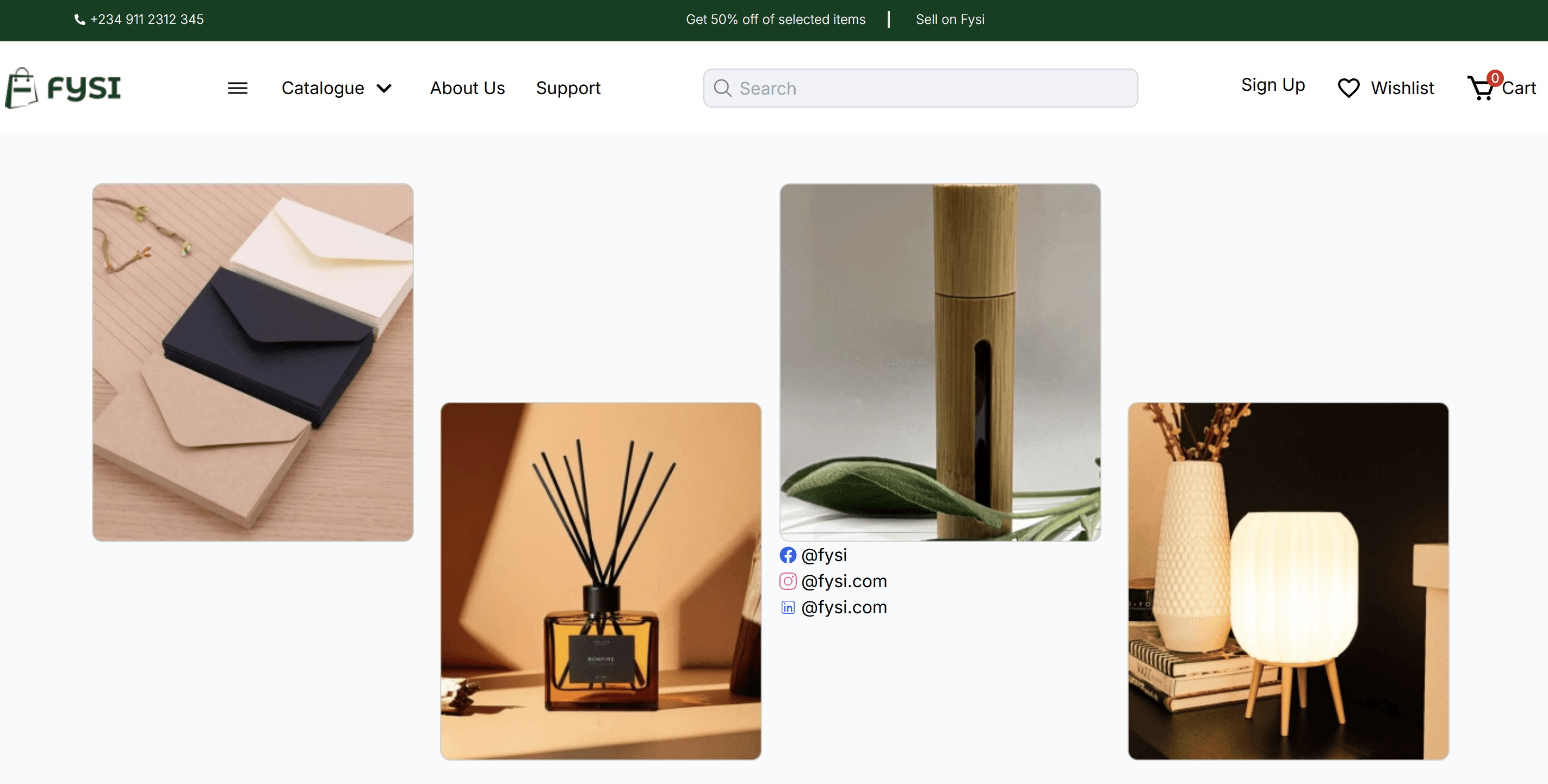
For the green house project I used Flexbox to align the images in rows and columns. It allowed me to control the positioning, alignment, and spacing of the images with ease. Flexbox’s justify-between, justify-center, and align-items properties helped ensure that the images were consistently spaced and aligned across different screen sizes.
o speed up the process and ensure consistency, I leveraged Tailwind CSS utility classes for quick alignment and styling. Classes like grid, flex, items-center, justify-center, and space-x-4 were helpful in controlling the positioning of the images without needing to write custom CSS.
Lessons Learned
One of the key lessons I learned from this project is the importance of choosing the right layout system for different use cases. Flexbox and Grid both have their strengths, and understanding when to use each was crucial in achieving the desired result. Flexbox works wonders for simpler, linear layouts, while Grid is more suited for complex structures like image galleries. I also realized that responsive design isn't just about resizing elements but about optimizing the layout and spacing for different devices. Tailwind CSS made it easier to manage this responsiveness, but I also learned the importance of testing the layout on various screen sizes to ensure consistency.